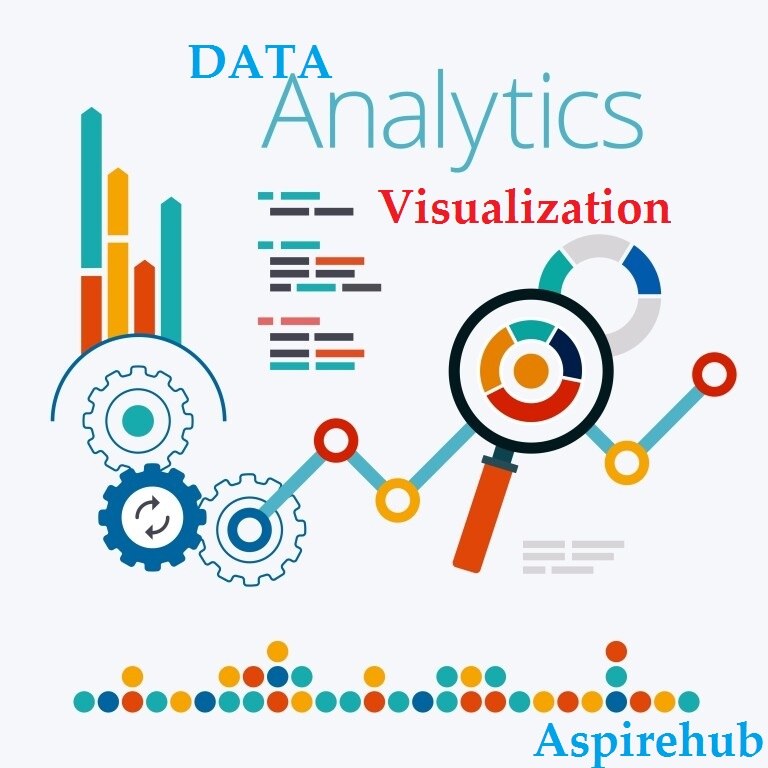
Data Visualization is a core component of the Business Analytics skillset. The course will provide an introduction to the main concepts of visual analytics such as visuals reports and dashboards with a hands-on tutorial to Tableau, a leading self-service BI and Data Visualization tool.
We will show you how to kickstart your Data Analytics Career with Tableau, Power BI, Excel, and MS Azure by solving Realistic Analytics Projects.
This The course is a hands-on Project Driven Learning - Here is the overview of projects you will work on
- -Project 1 - Discount Mart (Sales and Profit Analytics)
- -Project 2 - Green Destinations (HR Analytics)
- -Project 3 - Superstore (Sales Agent Tracker)
- -Project 4 - Northwind Trade (Shipping Analytics)
- -Project 5 - Tesla (Stock Price Analytics)
What You Will Learn –
- By the end of this course, you will understand the inner workings of the data analytics pipeline- from joining, filtering, and extracting data to developing interactive dashboards for your clients.
- Develop 5 interactive dashboards and showcase them online to create a great profile of work for your Resume.
Course Highlights
- Connect to different data sources such as Excel, Google Sheets and even servers!
- Be able to create in-depth analyses with bar charts, line charts, doughnut charts and even geographical maps.
- Develop a solid understanding of how calculations on Tableau, Power BI, and Power BI work
- Be able to understand joining data sources on Tableau and understanding types of joins
- Work with sets and Level of Detail Calculations
- Understand how Groups and Hierarchies on Tableau Works
- Introduction to Google's Data Studio and Oracle Analytics Cloud
- Teacher: Olabode James